The Difference Between a Showroom and a Shop
The two space types look similar from outside, but what the visitor does inside is entirely different. In a shop the aim is to sell the product during that same visit: flow is fast, display is dense, and the till line is the defining element of the plan. In a showroom the aim is to prepare a decision. The visitor stays longer, picks the product up, puts two options side by side, usually sits down with a consultant, and decides days later.
That difference changes every decision about the space. In a showroom the display thins out; room to look is left around every product. Comparison surfaces, the sample wall and the consultation table move to the centre of the plan. In a shop the number of products per square metre is a measure of success; in a showroom the opposite applies: too many products make the product invisible.
- Shop: fast flow, dense display, till-focused layout, immediate purchase
- Showroom: long visit, sparse display, consultant and table, delayed decision
- Mixed model: in furniture, tile and kitchen retail the two are combined; the space is then divided into two zones
Window and Façade: The First Three Seconds
The window is the most expensive square metre in the space. Someone passing by looks for a few seconds on average, and within that time either decides to come in or walks on. The job of window design is to deliver a single message in those few seconds; a window that tries to deliver three messages conveys none of them.
There are three technical decisions about the window at the design stage. The first is depth: whether the back of the window is closed off or open to the shop. A closed window gives freedom to stage but hides the interior; an open window makes the space look larger but any untidiness behind it is directly visible. The second is reflection: during the day the glass reflects the building opposite and the sky, which makes the window invisible. The lighting level inside the window has to be kept above the brightness outside, and fittings angled away from reflecting in the glass.
The third is use at night. In Antalya street traffic continues after closing; a window that still works when the shop is shut is free advertising space for the business. Putting the window lighting on a separate circuit from the shop lighting and controlling it with a timer is a small decision at the design stage with a high return.
 The interior seen through the shop window: in an open window scheme the order behind it is directly visible.
Customer Flow and Layout
For the first few metres after coming through the door a visitor sees nothing; their eyes adjust to the interior and they look for their bearings. That area is called the decompression zone, and placing product directly in front of the door destroys it. A display set immediately inside the entrance is walked past unnoticed by most visitors.
The layout is built to pull the visitor into the depth of the space. The classic device for this is creating a strong focus on the back wall: a tall display wall, a lit material board or an emphasised product island. As the visitor walks towards that focus, they pass the other products along the way.
- Decompression zone: a product-free area at the entrance, given over to orientation
- Main route: the uninterrupted, generously wide path that carries the visitor to the rear focus
- Stops: islands and podiums along the route that invite closer inspection
- Consultation point: a seated area away from noise and door traffic
- Till and information desk: a position that oversees the whole space without cutting across the flow
Accessibility is an inseparable part of this plan. The main route and the consultation area have to stay wide enough to turn a wheelchair in, and if there is a threshold difference at the entrance a ramp has to enter the design from the start.
Product Lighting: Showing Colour Truthfully
This is the most frequently skipped subject in showroom design and the one that affects the result most. The job of the lighting is not to light the space but to show the product truthfully.
The first criterion is colour rendering. With products where colour determines the purchase decision — tile, natural stone, textiles, furniture, timber and paint — the real colour of the product is not visible under a fitting with poor rendering. The consequence is not merely an aesthetic flaw: the customer sees a completely different tone at home, and a return or a complaint follows. High colour rendering fittings should be used for product lighting, and that value stated explicitly in the purchasing schedule.
The second criterion is contrast. A showroom lit evenly everywhere looks flat and no product stands out. Leaving a clear difference between the general lighting and the accent light on the product tells the eye what to look at. Without accent light, display does not work.
The third is choosing colour temperature according to the product. Warm light enriches timber, textiles and beige-cream tones; neutral white light makes white sanitaryware, grey tile and metallic surfaces read as clean. Lighting different product groups at different temperatures within the same space is possible, but the transitions have to be deliberately composed; a random mixture makes the space look neglected.
The fourth is glare. The light source of the fitting should not fall directly in the visitor's line of sight but arrive at the display surface at an angle. This matters even more with glossy products: polished tile or a lacquered surface reflects a badly angled spot straight into the eye. For more on this, have a look at our guide to choosing spot lighting.
Display Systems: Shelving, Podiums and Modularity
The display system is the part of a showroom that changes most. Collections change, the product range widens, the seasonal scheme is refreshed. For that reason display should be designed not as a fixed piece of joinery but as a changeable system.
- Load capacity: tile, natural stone and porcelain products are heavy; shelving and hanging systems have to be calculated for that load. A shelf built to domestic furniture logic sags under a board of tiles.
- Adjustability: continuous hanging channels and perforated systems allow shelf height to be changed without tools.
- Sample access: for products the customer can pick up and hold to the light, drawers or removable boards are far more effective than a fixed display case.
- Podiums and islands: these stage a large product on its own; room to walk around it has to be left.
- Material language: display furniture should not compete with the product but stay neutral. For timber and metal frame solutions, see our article on furniture and aluminium separator solutions.
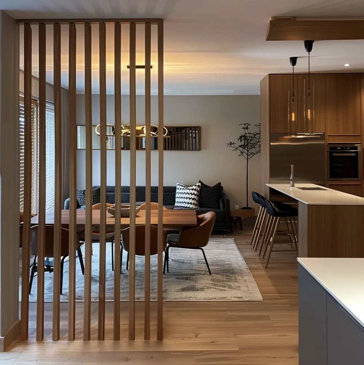
 Continuous hanging channel and slatted wall: display height can be changed without tools.
Flooring, Walls and Acoustics
Two criteria decide the floor: wear classification and the relationship it forms with the product. If domestic grade material is used on a heavily trafficked showroom floor, the most walked line dulls visibly within a few years and the space begins to look neglected. Commercial grade porcelain tile, terrazzo and commercial grade LVT carry that load.
The second criterion is more easily missed: the floor should not compete with the product on display. In a showroom selling tile or parquet, keeping the floor neutral and matt lets the product come forward. Leaving a dirt-trapping barrier matting at the entrance both extends the life of the floor and reduces the risk of slipping on rainy days.
Acoustics is the subject almost never considered in showroom projects, yet its effect is felt directly. A space with a high ceiling, hard surfaces and little furniture echoes; conversation between consultant and customer becomes difficult and the space becomes tiring. Using sound-absorbing panels in the suspended ceiling, resolving part of a wall with a textured surface, or defining a consultation area with a rug removes this problem at the design stage.
Flexible Electrical Infrastructure
A showroom display changes several times a year on average. The space has to take that change without breaking into the ceiling or repainting the wall. The only way is to build the infrastructure flexibly from the start.
- Continuous track: running track the full length of the ceiling makes fitting positions movable without calling an electrician. A ceiling built with fixed recessed spots causes trouble at the first display change.
- Floor outlet boxes: leaving recessed floor boxes in the areas where islands and podiums will stand prevents the look of a solution improvised with extension leads.
- Circuit separation: the window, general lighting, accent lighting and consultation area should be on separate circuits, so that different scenarios can be set through the day.
- Data and low voltage: screen, tablet, audio and camera points have to be planned at the design stage; a data cable pulled afterwards runs visibly.
- Consumer unit capacity: because lighting density is high, whether the existing consumer unit carries the load has to be measured during the survey.
Back of House: Storage, Samples and the Consultation Table
The back of house is the part most often shrunk in showroom projects and most often regretted afterwards. When storage is narrowed to enlarge the sales area, overflowing product and packaging leak into the sales floor and undo the whole effect of the space.
Three functions have to be planned at the back: product and packaging storage, a sample archive, and a staff area. The sample archive is critical particularly in tile, furniture and kitchen showrooms; having the alternatives to be shown to the customer organised and quick to reach directly affects how the conversation flows.
The consultation table, on the other hand, should sit in a quiet corner of the sales area rather than at the back. A point away from door traffic and window noise, yet still feeling the atmosphere of the space. Enough width on the table to lay samples out, a screen beside it and sufficient sockets make it easier for the decision to be made there.
Signage, Façade and the Approval Process
Sign size, its illumination and any intervention to the façade are subject to the urban design and signage regulations of the relevant municipality. On some streets and in some districts there are limits on dimensions, type and illumination. If the building sits within a complex or a business centre, a management decision is also required.
Enlarging the window opening on the façade or changing the frames is a separate approval process because it concerns the common parts of the building, and if it requires intervention in the structure it calls for an engineering assessment. The business licence, fire safety and escape route requirements also affect the layout directly: the display arrangement must not narrow the escape route.
Checking these items before the project starts removes the risk of having to dismantle work after it is finished. We set out how the design process works in detail on our architectural design service page.
Showroom and Retail Design: Common Mistakes
- Putting product at the entrance: it destroys the decompression zone and that display goes unnoticed.
- Lighting everything evenly: without contrast no product stands out and the space reads like a warehouse rather than a showroom.
- Disregarding colour rendering: the product appears one colour in the showroom and another in the customer's home.
- A fixed ceiling scheme: on a ceiling with no track, the first display change turns into demolition work.
- Shrinking the storage: overflowing packaging leaks into the sales floor.
- Skipping acoustics: in an echoing space the conversation becomes tiring.
- Display furniture competing with the product: eye-catching shelving overshadows what it holds.
- Leaving signage to the end: a sign produced without approval gets taken down.
In a showroom the measurable output of design is the time a visitor spends in the space and how often they sit down with a consultant. If the space increases those two things, it has been set up correctly.
If you would like to work through the survey, concept and design stages for a showroom, a shop or a mixed commercial space, get in touch with us. We offer a free on-site survey and assessment for commercial projects.